HCIstudio
Research Group
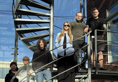
Welcome to the HCIstudio research group at the Humboldt University of Berlin. Our passion for Human-Computer Interaction (HCI) research drives us to shape the future of how people interact with technology. Our team pioneers advancements in interactive artificial intelligence, adaptive user interfaces, physiological interaction, extended reality, and HCI research methods.

Latest News
Updates from the lab: media mentions, team changes, accolades, and more
Recent Publications
Open access and supplementary material to all of our conference and journal papers
Publication Keywords
A selection of keywords describing our recent publications. Don’t forget to check out the full list of recent publications, too!
Artificial Intelligence
Augmented Instruments
Augmented Reality
Concerns
Cycling
Diversity
Electromyography
Electron Microscopy
Embodied
Extended Reality
General Aviation
Hazards
Human-AI Interaction
Immersive Analytics
LLMs
Mixed Reality
Placebo
Public Perceptions
Safety-Critical Environments
Virtual Reality